

Between 2009 and 2013, the Kepler telescope stared at a patch of stars in some faraway constellations. It waited patiently for planets to cross in front of those stars, detecting their presence when light from the star dipped.
A technical failure interrupted Kepler’s stargazing in 2013, but not before the telescope tracked down and confirmed 1,030 planets, as well as 2,740 unconfirmed candidates (according to the Kepler website). More may yet be found in the data that Kepler sent back before it broke.
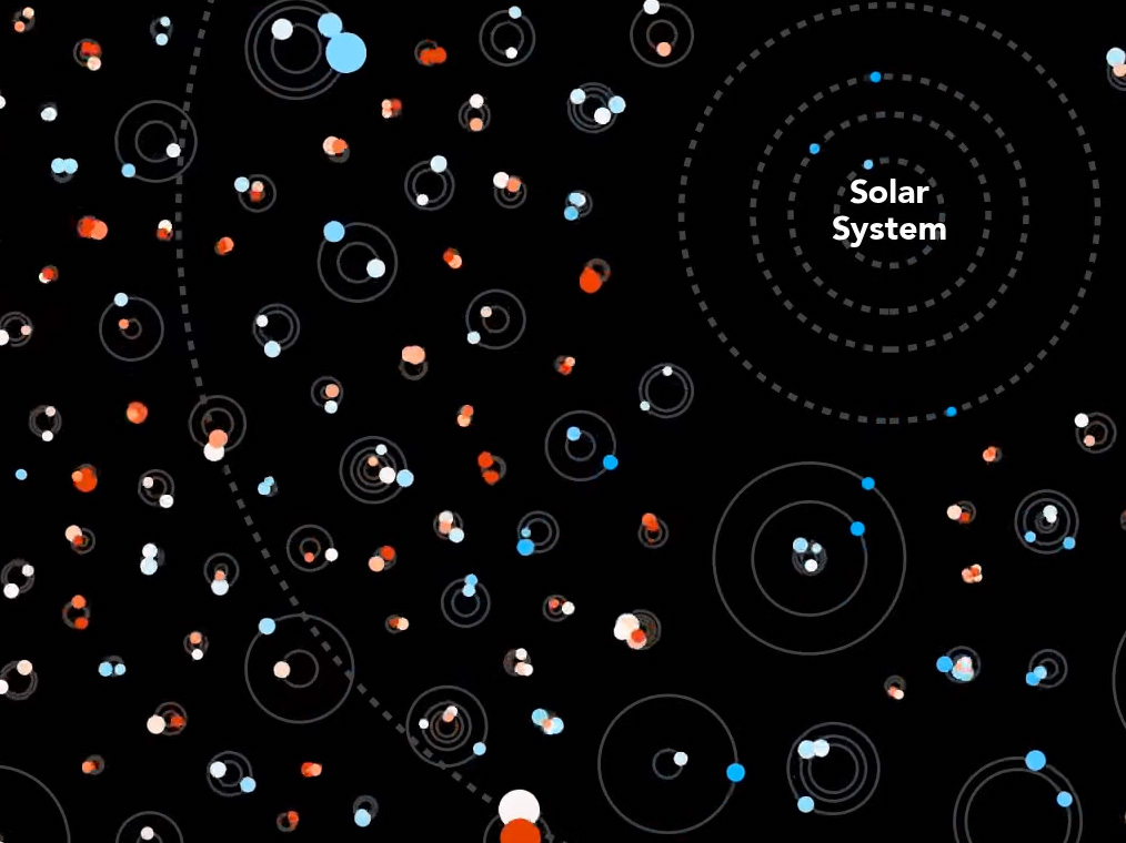
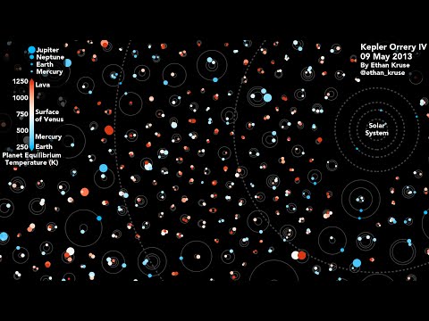
Now you can see how these alien solar systems stack up against our own. In a new animation, astronomy grad student Ethan Kruse compares the orbits of many exoplanets to those of the planets in our neighborhood. Our solar system is shown on the right-hand side of the animation.
The planets are not drawn to scale compared to the stars and orbits (you wouldn’t be able to see them if they were), and the stars aren’t located this close together in real life. Still, you can see the relative size of the planets as well as an estimate of their temperatures. The animation also underlines something Kepler taught us: that our solar system isn’t the standard model for the galaxy. Before Kepler, scientists thought that other solar systems would be shaped like ours, with small rocky planets on the inside, icy planets on the outside, and gas giants in between. Now we realize that solar systems come in all sorts of shapes and sizes.
However, the Kepler data we see here is biased. In order to confirm an exoplanet, Kepler had to see it cross the star several times–this meant it was more likely to notice planets that orbit close to their stars and therefore pass more frequently. And, since Kepler discovered the planets by the light they blocked, it was easier to detect massive Jupiter- and Neptune-sized planets than small worlds like our own.
Kruse says the animation shows 685 multi-planet systems, representing 1,705 exoplanets. By the sounds of it, he’s including unconfirmed planets in the animation, assuming that most of them will turn out to be real planets. It’s a fair assumption, since other studies estimated that at least 90 percent of candidates would turn out to be real planets.
Daniel Fabricky from the University of Santa Cruz has created similarly mesmerizing animations of Kepler data. Whereas his latest was from 2013, Kruse’s animations include the latest findings.
[H/T Boing Boing]
