
We may earn revenue from the products available on this page and participate in affiliate programs. Learn more ›
Last week, Apple pushed out a variety of software updates for all of its devices, including Watch, iPad, and the iPhone. iOS 14 has probably hit your device already, but it can take some getting used to. Here are some new features to try—some of them are easy to spot, while others take a little more digging.
Translate

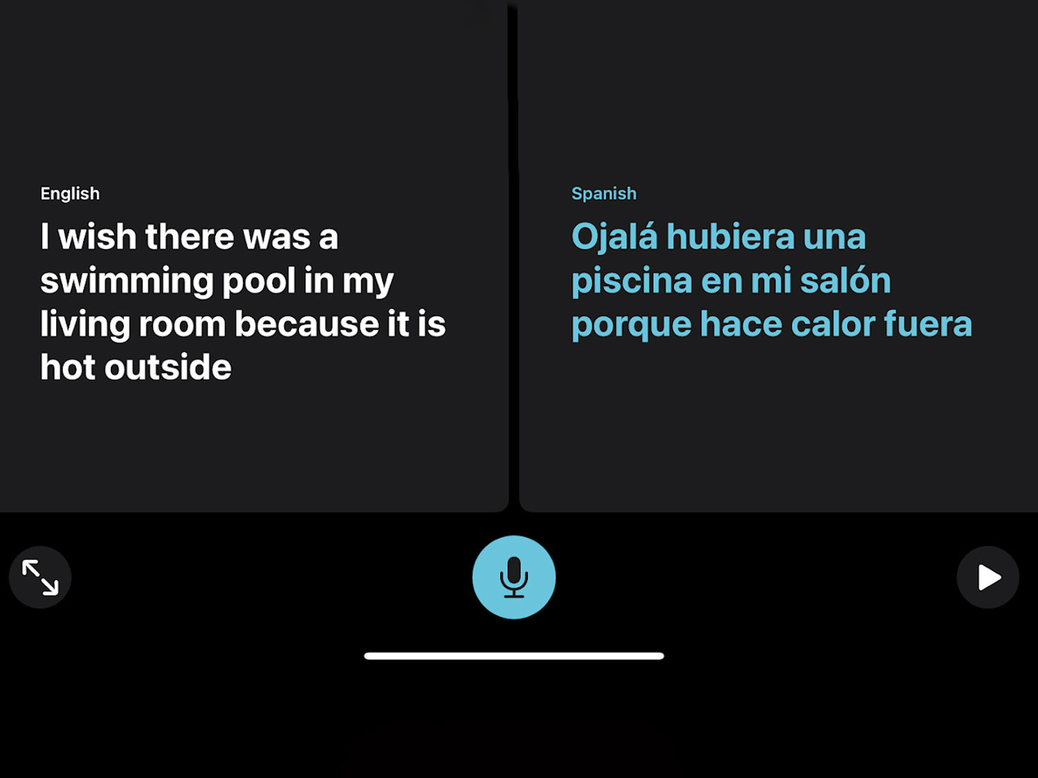
Apple devotes a new app to its translation technology, which supports 11 different languages and offers several different layouts depending on your specific needs. The app can listen to a speaker and spit back their words in a different language with very little delay. But, it has some handy display modes that make it particularly useful for communicating with others.
Attention mode displays a large, clear version of what you’re saying, so if you want to hold it up to another person you can ask for help or quickly communicate a message to someone. Conversation mode allows two speakers to talk in real-time with their translated words appearing on their respective half of the screen.
The translations typically take place in the cloud, but you can download specific languages directly to your device and get access to all the features in those languages without a connection. That could come in extremely handy if you’re traveling and can’t rely on a steady signal.
I’ve had it crash a few times this week, mostly when switching between modes, but the actual translation seems quick and mostly accurate.
Home screen widgets
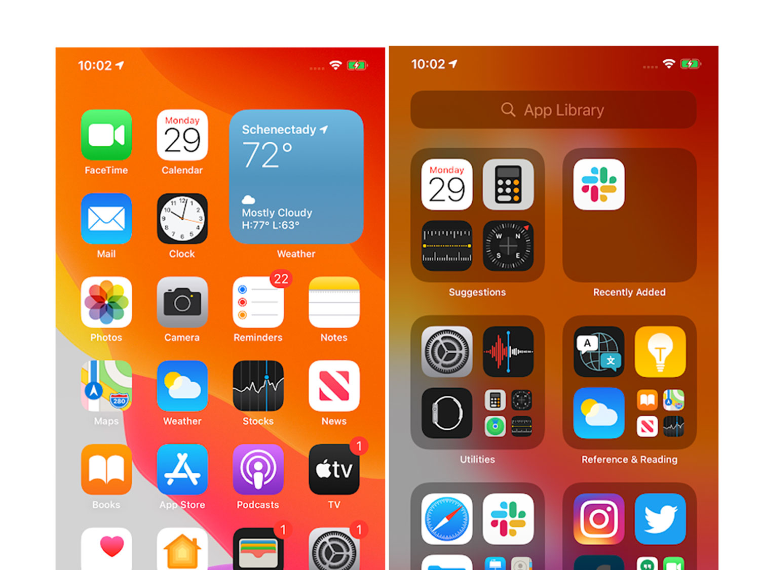
The Today View in iOS is a handy preexisting feature that allows you to get snapshots of what’s going on in your various apps. You access it by simply swiping right while you’re on the home screen to reveal a stream of information-packed widgets. If you’re not using it all the time, however, it’s easy to forget that it exists. In iOS 14, those widgets are making their way directly to the home screen so you can start your information bombardment as soon as you’ve unlocked the device.
Widgets now come in three different sizes depending on how much screen real estate you’re willing to devote to a specific app. You can peruse the Widget options for your specific apps via the Widget Gallery. TikTok users have already started designing and posting about their fancier phone home screens.
Once third-party widgets start pouring in, I worry home screens may get rather overwhelming, but responsible Widget arrangement could also mean quicker access to necessary information and less time spent poking around within apps. On the other hand, it could make the whole thing feel more like Winamp, which I can appreciate.
App Library
With the home screen now taking on new Widget-hosting duties, the app grid is even more crowded. The new App Library lives after your last page of apps and arranges them into handy categories. Recently Added and Suggestions live at the top in order to make your most frequent apps quick to access.
You can hide pages of apps, so you can reduce your entire dashboard to curated collections of widgets and just rely totally on the App Library to find specific applications.
Message mentions
Group chats can get out of hand quickly when it comes to notifications, but now you can customize the chaos in order to keep it in check. Participants can now use the “@” in order to directly address someone in the chat, just like in other apps, like Slack. That allows you to customize your notifications so your phone will only ping if someone is talking directly to you. Participants can also add replies in threads to specific messages so the entire conversation doesn’t become impossible to follow.
Bike directions in maps
At the WWDC keynote, Apple said that Maps users requested cycling directions more than any other feature. In iOS 14, Maps will now guide bike riders to their destinations via cycle-friendly routes that have dedicated bike lanes and relatively light traffic. The routes will also indicate when there are steep hills along the way so you can plan when to eat your Power Bar for maximum pedal power.
Right now, the directions are only available in a handful of cities like NYC and San Francisco, but Apple says it’s planning to roll them out to more places soon.
Adaptive lighting
Automation has motivated a huge chunk of the Home updates in iOS 14. The Adaptive Lighting update allows compatible light bulbs to automatically change their color throughout the day. So, if you want bright white light in the afternoon, and warmer, more mellow light in the evening, a simple automation can do that for you without having to think about it.
Plenty of other platforms allow you to create routines like this, but this is the kind of simple thing that Home has been conspicuously missing.
App Clips
Abandoned apps that you use once and then abandon tend to clutter up your device and go out of date. App Clips are designed to alleviate that problem. Users can access App Clips in a wide variety of ways including scanning a redesigned QR code, tapping an NFC-enabled beacon, or clicking a link from Maps, Safari, or Messages. Each Clip must be under 10 MB and doesn’t add itself to your home screen like a full app. They’re designed for one-off circumstances like if you’re paying to rent a scooter or make some other kind of micro transaction.
Once users are typically relying on 5G speeds, those 10 MB downloads will seem almost instantaneous.
Privacy labels in the App Store
Soon, each app in the App Store will have a simplified label that indicates what kind of data the software will collect about you and whether or not the developer plans to share it with others. It will also let you know if the data collected will be anonymous or directly linked to your identity.
This will likely be one of the more controversial updates, but if it’s done correctly, it could give users a much better picture of how much personal info they’re giving up every time they download a new app.
Recording indicator
A simple dot in the top right corner of the screen now indicates when the camera or microphone is recording you. Many conspiracy theories claim that apps constantly listen and watch in the background to target you with ads, but now Apple will let you know for sure when something is recording.
It’s hardly noticeable when you’re using it in everyday life, but I look forward to a time when the dot shows up and I have no idea why and it makes me paranoid forever.
Separate focus and exposure controls in the camera app
Apple’s camera hardware has been great for years, but the stock camera app is overly simplistic. Now, it offers more manual controls, including the ability to lock the focus in one spot and the exposure metering in another. That makes shots like silhouettes of dark shapes in front of dramatic sunsets much easier to execute. It’s a simple upgrade, but for photo nerds like me, it’s a notable one.
Tap the back to launch
As part of the accessibility additions in iOS 14, users can now tap on the back of the phone—you can use two or three taps—in order to perform certain actions. For instance, you can map three taps on the back of the device to take a screenshot. Apple has allowed users to shake the device in order to perform some tasks without actually touching the screen, but I have never found those particularly handy.
