

With great editing power comes great responsibility—the more easily you can change things about your photos, the more carefully you have to do it.
Over the past few years image editing tools have gotten more advanced, more user-friendly, and, in some cases, even completely automatic. Now, with a few clicks you can swap the sky in any image, drastically edit colors, and even change someone’s facial expression. While using this technology is fun, things can easily go south—a lot of photographers went seriously overboard with High Dynamic Range photography in the early-2010s, and the technique has only been rehabilitated to overcome the limitations of mobile cameras. Knowing how to use these tools, when to apply them and, most importantly, when to stop, will make a huge difference as you edit your photos.
Even though it’s a paid program, Adobe Photoshop is still the biggest name in the game, so I’ll be mostly going through the tools and features this software has to offer. However, the general principles behind these tips apply to whatever image editing app and techniques you use.
Start with a plan
The secret to successful photography is intention. If you start with an idea of what you want and work toward it—even if you mess up or change your mind on the way—you’re much more likely to come up with a strong image than if you just shoot away randomly. The same principle is equally important when you’re editing.
Now, don’t worry—making a plan doesn’t require submitting a six-step strategy to The Photographers Guild before even opening Photoshop. It only requires that you look at your image and ask yourself what you’re trying to achieve.
Maybe you want to make sure your subject is the main focal point of your photo, or you’re trying to make your holiday shots look sunny and inviting. The platform you’re using can help you figure this out as well—maybe you need a clean and professional portrait for LinkedIn, or you’re aiming for a cool shot that’ll get you those Instagram likes. Any goal is a good one, as long as it makes sense.
Here are some examples of shots I’ve edited, and what I was trying to achieve.
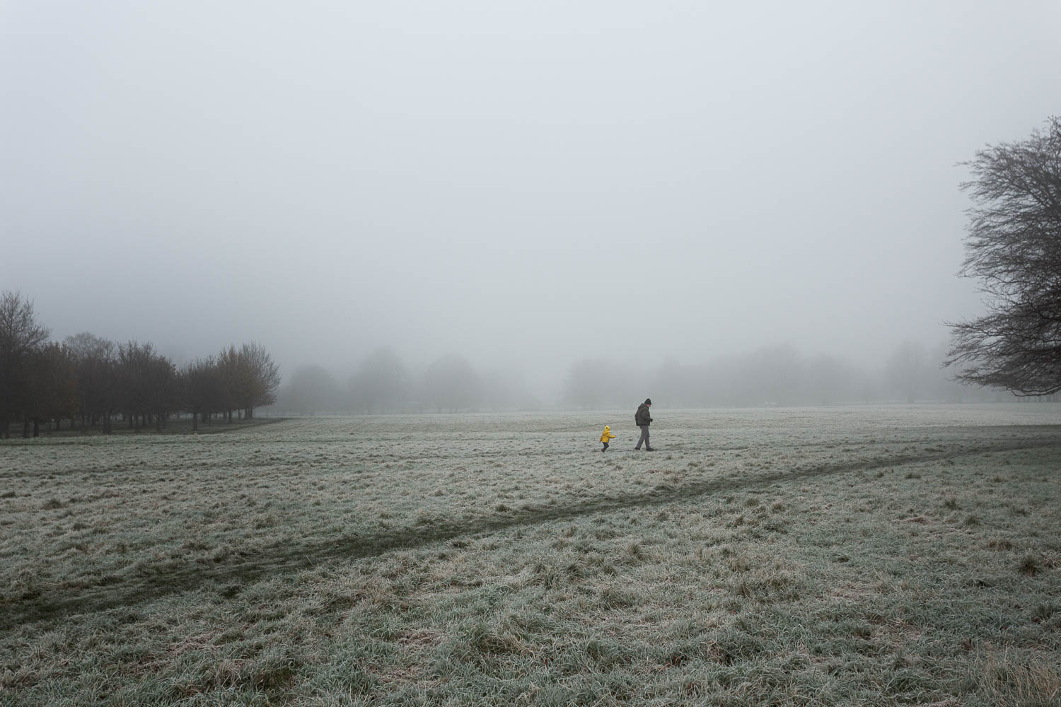
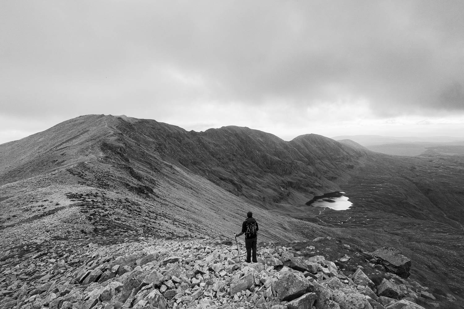

If you want, you can also make a more detailed plan, including a breakdown of what you need to do to get the results you want, but that’s not so important unless you’re tackling a large, complicated project that will take a lot of editing work.
Start by getting the basics right and fixing problems
While it’s tempting to dive in and use the cool stuff, it’s best to hold your excitement in check and start by taking care of any problems with your image. Powerful editing tools can often magnify existing issues and make it harder to fix them later.
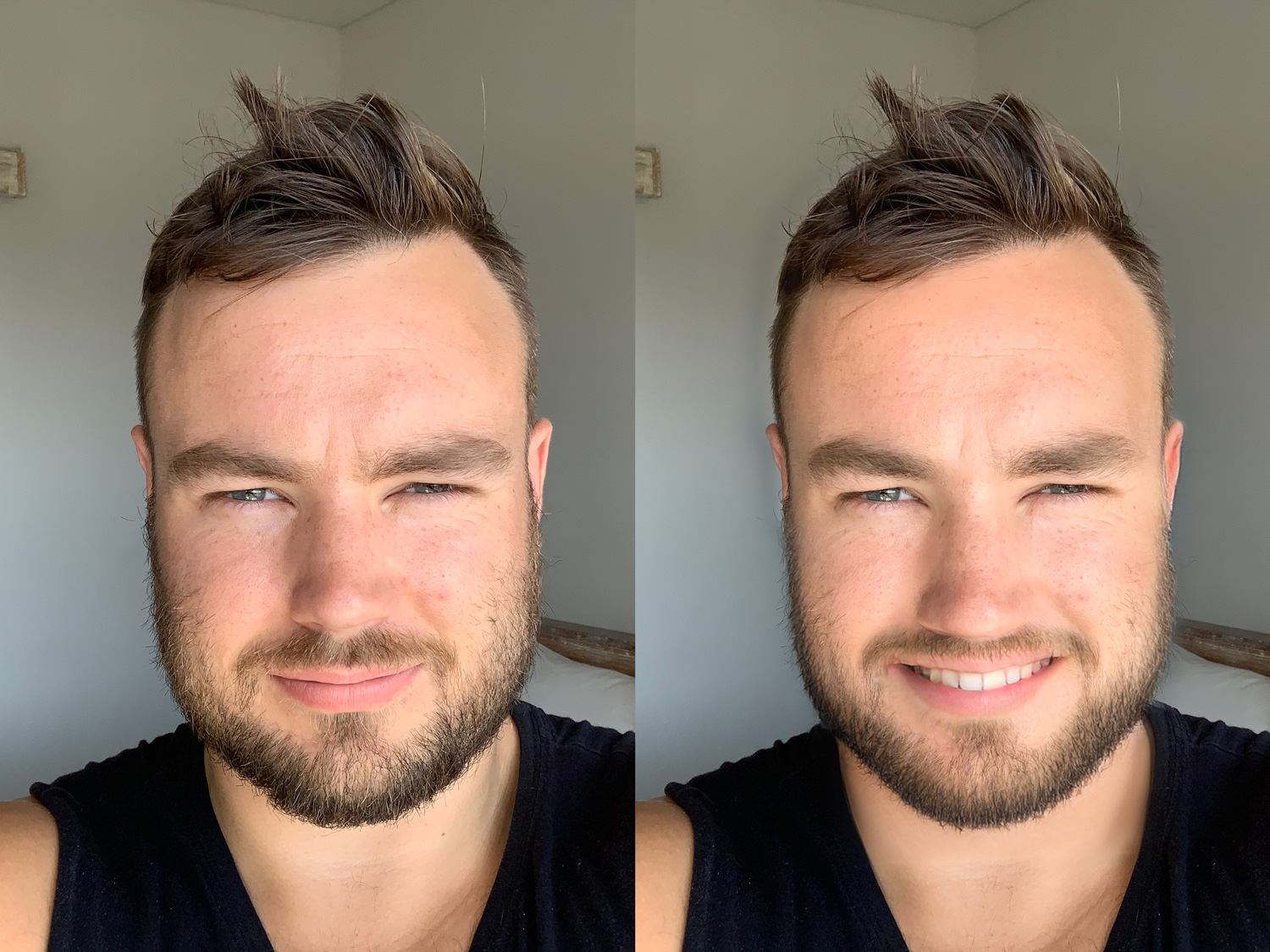
Just look at this side-by-side photo of me—it’s the same one, but it only took me 30 seconds to put that creepy smile on my face using Photoshop’s Smart Portrait neural filters.
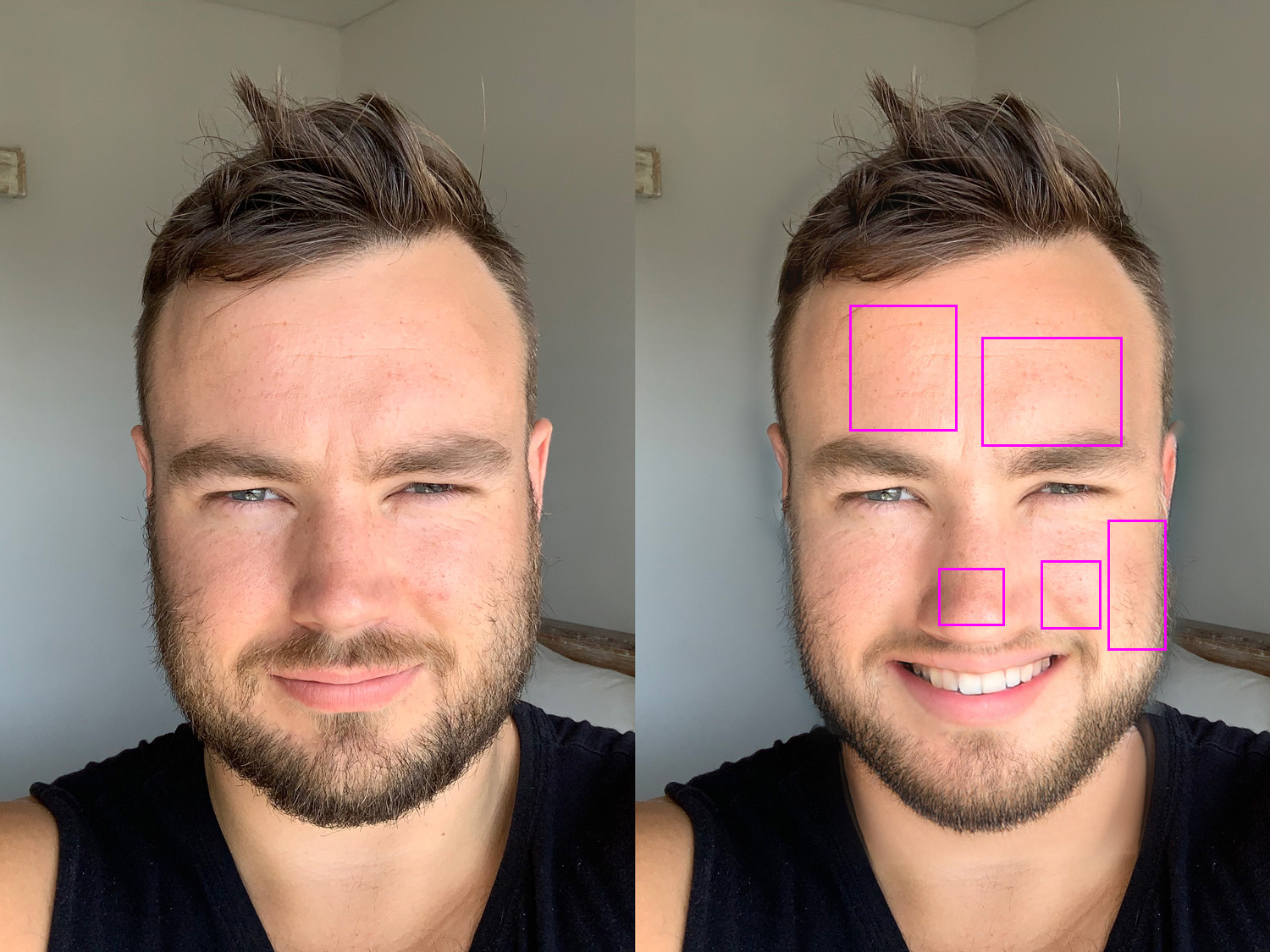
In the original shot (on the left) you can see I’ve got a few blemishes, but using this Photoshop filter smeared them on a larger area of my face. Also, that small spot on my right cheek is more noticeable now because of some weird, automatic brightening effect. Overall, it just made me look worse.
Instead, before using any big artificial intelligence-driven, over-the-top editing feature, start with a checklist and take care of the basics:
- Crop your image to the aspect ratio you want with the Crop tool. The simplest way to select it is with the keyboard shortcut C on both Windows and Mac. Otherwise, you can find it on the default Tools panel—it’s the fifth button, top to bottom.
- Adjust the brightness and contrast as needed—on the main navigation bar go to Image, Adjustments, and then choose Brightness/Contrast.
- Fix any color issues, like the white balance or an unwanted color cast.
- Clean up any spots (use the Spot Healing Brush which you can grab with the keyboard shortcut J), lens flare, or any other distractions, like stray hairs, or even photobombers,. You might need to use the Clone Stamp tool (hit S on your keyboard on Mac or Windows) or the Regular Healing Brush, which you can find by cycling through the different healing tools using Shift+J on both major operating systems.
At the end of the editing process, you will probably need to tweak some of these things again, but you’ll make your job a lot easier by addressing them first.
Look for the big issues
There are two big problems that over-edited images often run into—either the lighting direction doesn’t match between the elements, or people look strange and unnatural, sometimes even like zombies or caricatures.
There’s also the sum of smaller problems, which results in things just looking bad. Let’s deal with those later.
Issue No. 1: The lighting direction doesn’t match
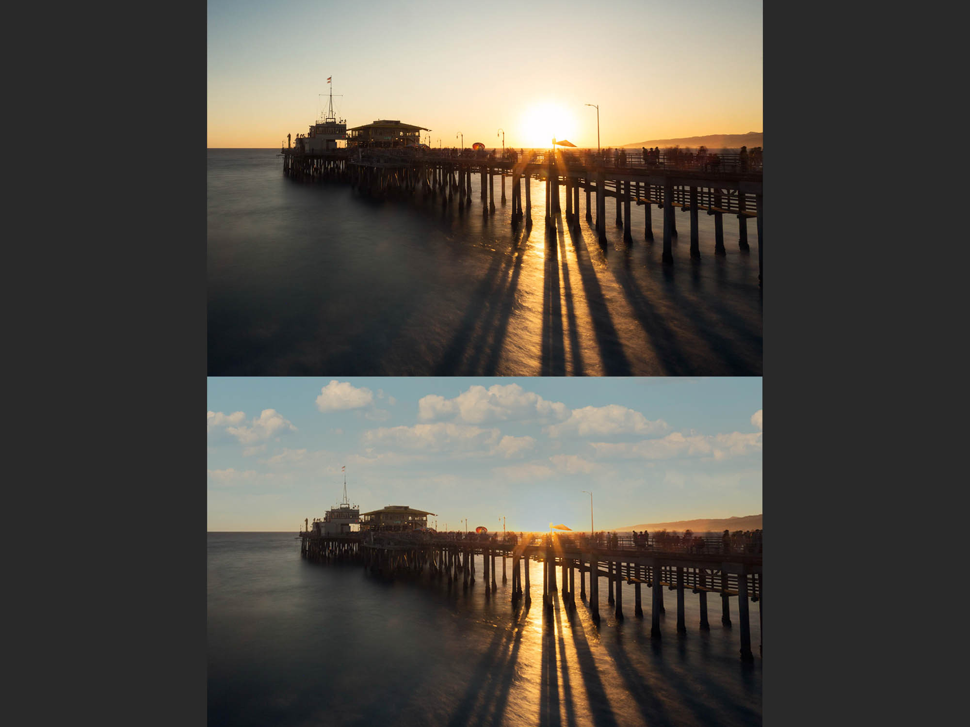
The sun is the main light source in a lot of photos, so if you replace the sky, you are also replacing it. Even if it’s out of the frame or you’re shooting indoors, its direction is still noticeable in your images.
Replacing the sky doesn’t change the shadows, highlights, and other effects of the sun’s light. Even with Photoshop doing its best to match the colors between the sky and the foreground, this is never going to work—the lighting is off even on Adobe’s official help site.
Unfortunately, matching the lighting when you’re compositing different images together is a skill that takes time to master. So as much as they try, this is one of the instances where automation has not been able to replace the experience of the human eye.
Issue No. 2: Strange and unnatural-looking people
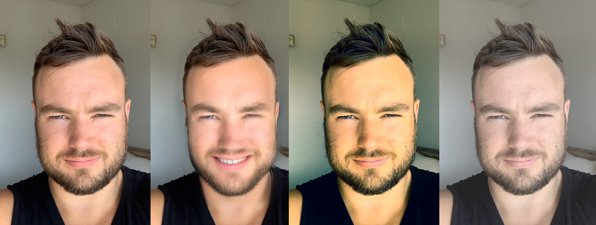
When you’re working on a landscape, there’s a lot of editing you can do that you just couldn’t get away with if you were working on a portrait or anything with people in them. This is because we are wired to recognize people, especially their faces, so your brain will definitely let you know when even the smallest thing is off. By playing around with colors too drastically or changing someone’s face in a weird way (with something like the FaceTune app, for example), you can turn an otherwise normal image into something that looks fake or worse—just badly edited.
If you’re going to experiment with any tools that automatically edit people, be very careful not to go too far.
Dial it back
The simplest way to stop yourself from going too far is to think about how much you want to use a particular effect, and then consciously dial it back somewhere around 10 to 20 percent. This is my strategy with every image I edit, no matter what tools I use. They’re not the problem—what hurts is how easy it is to get caught up using them. Let’s revisit that oh-god-terrifying smiley pic of me.
By using lower values for the sliders (25 versus 50 for the Happiness slider, and 6 versus 25 for the Surprise slider), it’s possible to use the Smart Portrait filter and produce something that works.
Step away (or get a second set of eyes)
When you’re editing a photo, it’s easy to keep tweaking things even when they’re not actually improving your image. Any time you’re not sure about something or think you’re finished, stop yourself from going too far wrong by stepping away from your screen, waiting 20 minutes, and then coming back to it. You’ll be surprised at how often you’ll be able to spot small problems or mistakes you had totally overlooked before.
Another similar strategy is to ask someone you trust to look at your photos. Even if they’re not a photographer, they’ll likely be able to tell you if something looks or feels off. They might not be able to put their finger on why—but that’s up to you to figure out.
Remember the Jurassic Park principle
In this 1993 classic, Jeff Goldblum’s character has one of the film’s more memorable quotes: “Scientists were so preoccupied with whether or not they could, they didn’t stop to think if they should.” This was said about reviving 30-foot-tall prehistoric predators, but it’s also a solid idea to keep in mind when you’re editing images.
Just because you can swap the sky in every image you take, doesn’t mean you need to. In some images it might be the thing that makes them pop, but for many it will just add problems. Similarly, the best way to get someone to smile in your photos isn’t Photoshop, but making them comfortable in front of your camera. If you’re relying on an AI filter to bust out the cheesy grins, something’s gone very wrong.
With all that said, these maybe-they-should-still-be-in-the-lab features are a lot of fun and will be a bigger part of image editing in the future. Just for the time being, set a plan—and show a little restraint. And please, don’t do anything stupid with your LinkedIn profile picture.
