
We may earn revenue from the products available on this page and participate in affiliate programs. Learn more ›
Dark mode is a user experience option uses inverted color palettes to provide mostly grayscale versions of your favorite social platforms and operating systems. For screen fiends hoping to stay away from the light—without actually turning said screens off—it’s a comforting alternative to the blinding white most websites traditionally offered.
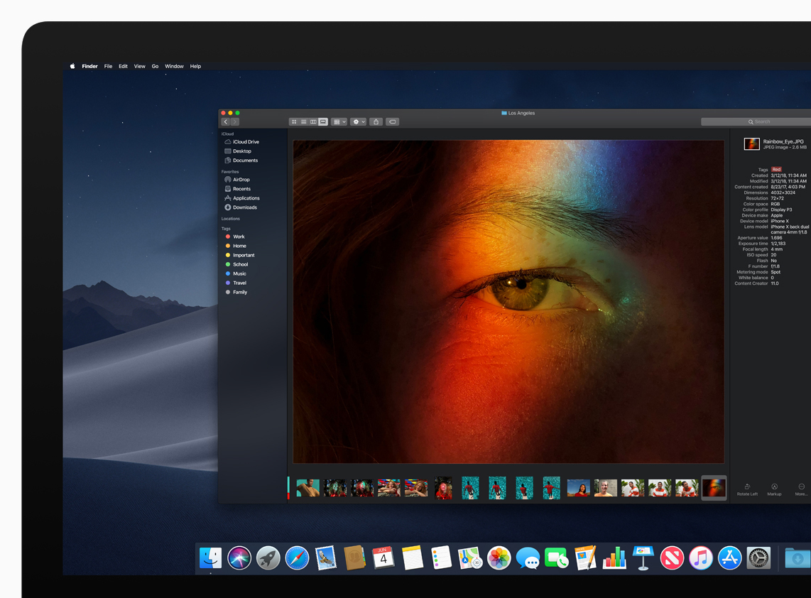
Twitter was among the first platforms to offer dark mode, also called night mode, rolling it out for Android phones in 2016. Available in your drop-down settings, you can click a little half-moon circle to enable it, instantly transforming the page from a stark white to charcoal gray background. But 2018 has proven to be the real year of the dark mode. The blackout strategy has spread to a half-dozen new platforms, including Reddit, Apple OS and iOS, Android phones, and YouTube. And more is on the way. Facebook’s Messenger app is rumored to be debuting its own midnight palette soon.
Dark mode’s metastasis has been a long time coming, but stepping into the shadows hasn’t been easy. Designing dark mode required social media giants to perform months of analysis, testing, and refinement—and reevaluate what it is their platforms really do.

“People had been asking Twitter to create an experience that is more comfortable to use in dimly lit environments,” Ashlie Ford, senior product designer for Twitter, told PopSci via email. As anyone who’s inadvisably scrolled the site at night, the bright white background can hurt. For many users, the black background solves these problems.
Serving individuals with light sensitivity or visual impairments was among Reddit’s highest priorities, according to Jonathan Chow, a senior UX designer at Reddit, who led the design of the site’s desktop night mode. Inversion strategies are often nested alongside accessibility features like subtitles, voice to text, and the ability to increase text size. But anyone can find ocular comfort, or an opportunity to customize their experience, in night mode, according to Chow. “A lot of our users are involved in gaming,” he says. Often, they’re playing late into the night. “So they’ll have their game up, and also their page of Reddit up. Without night mode, it’s a bright screen that’s either distracting… or downright painful.” Other strategies commonly used by gamers include blue light-masking glasses and ambient lights behind digital displays.
Before Chow and his team could implement dark mode on Reddit, they first had to conduct an internal audit of the entire site. Previously, he says, every color on the website was assigned a static hex code—a number that corresponds with a very specific shade. (#FFFFFF is pure white, while #FFFAFA is snow white.) Because dark mode inverts everything with the simple click of a button, Chow needed to find a way to shift the site’s colors quickly and cleanly. As a result of the audit, Reddit paired down its palette from roughly 50 colors to 20, and made them responsive in the shift from day to night.
“One really brutal way you can make your own dark mode is just by inverting everything,” Chow says. But an intentional dark mode design is harder, requiring designers to mastermind how each element on the page will render. To ensure content is softer on the eyes, but still legible, Reddit designers heightened contrast. On the regular site, the background is white and the text black, but in dark mode, the light gray text stands against a near-black surface.
“For other spaces, such as banner images and items like that, which wouldn’t invert, we wanted to help it at least blend in to the dark mode experience by lowering the overall brightness,” Chow says. While everything around them changes, photos and memes uploaded by users stay the same—a marked difference from things like Apple’s “night shift,” which turns blue screens yellow at night for comfort, but ends up altering content profoundly, causing photos and videos to look unnatural.
Most things went according to plan, but there were some surprises along the way. Chow’s team found that when the website fed a device true black backgrounds, pixels in OLED screens like those in flagship smartphones or high-end TVs would turn off completely. As a user scrolled and color content came into view, the pixels would turn back on, but with a distracting fade. “We had to bump up the background colors,” he says. Reddit users seem happy with Chow’s tactics, but Ars Technica and others criticized Apple, which recently released a grayscale experience on its operating system, for developing a dark mode that was actually too light to use.
In addition to serving night owls, visually-impaired users, and gamers, dark mode serves our batteries. Earlier this month, Android announced maximum white ate up six times the battery power as maximum black, opening up a new dark mode market: people who forgot their chargers at home.
