
We may earn revenue from the products available on this page and participate in affiliate programs. Learn more ›
The first crop of Windows 8 laptops are here, and they’re much more interesting than, say, the first laptops to run Windows 7, or Windows Vista, or really any hardware that’s ever accompanied a new version of Windows. That’s because Windows 8 isn’t really like any other version of Windows, and we’ll get to that in a bit. I’ve been trying out a variety of Windows 8 laptops, and the Lenovo Yoga 13 is, so far, my favorite–the one I recommended to a roommate without hesitation (despite its flaws), and the one I grabbed whenever I needed to test something on Windows 8. Here’s why.
What is it?
The Yoga 13 (technically, the Lenovo IdeaPad Yoga 13, the “IdeaPad” part meaning this is for humans and not businesspeople) is an “ultrabook.” This is a garbage nonsense marketing word pushed by Intel and mostly means “kind of like a MacBook Air”–thin, light, and fast, with certain sacrifices made to keep it that way, like eliminating the optical drive and ethernet port.
The laptops aren’t garbage nonsense, though. Laptops like this aren’t for everyone, and possibly they’re not even for most people who obsessively read laptop reviews on the internet, but I think this is what a consumer laptop should look like–it’s designed to serve the most people in the best way. If I was shopping for a laptop, that category is where I’d look.
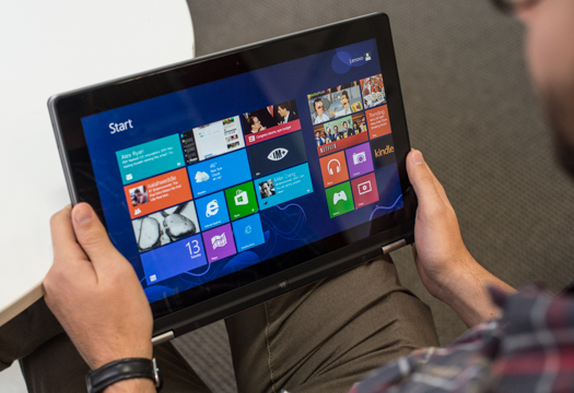
The Yoga 13 has a 13.3-inch display, and that display (or rather, what you can do with the display) is what really sets the laptop apart. It folds 360 degrees, all the way around, so the back of the screen eventually snaps into place against the underside of the keyboard, turning it into a tablet.
Oh, and some specs: my test unit came with a 1.7GHz Core i5 processor, 4GB of memory, a 128GB SSD, and integrated graphics. You can upgrade all that stuff, but it still isn’t barnburner specs. And that’s perfectly fine; Microsoft has gotten much better at optimizing hardware for software so the spec race is mostly irrelevant. (They did this to very good effect in Windows Phone: while Android phones were messing around with battery-draining quad-core processors, Windows Phones ran smoother and faster on hardware scarcely half as fast.) What matters isn’t how big those numbers are, it’s how it performs. And the Yoga 13 is very fast and fluid indeed.

Windows 8
Hardware is software, software is hardware. They are one product, one experience. It doesn’t make sense to review just one; the quality of the Yoga 13, for example, is totally wrapped up in the quality of Windows 8. So, here’s what it’s like to use Windows 8 on a laptop that’s specifically designed for it.
It’s jarring. This isn’t a bad thing, not for me and probably not for you. Playing with a totally new interface, one that works not entirely like anything else out there, is kind of fun. It’s spelunking. Onnnnn the other hand I think Windows 8 will freak the hell out of a less gadget-inclined person, even if they’ve been using Windows for decades.
It’s a little schizophrenic. For the purposes of clarity, I’m choosing to name the two disparate interfaces “tablet mode” and “laptop mode.” Tablet mode is a touch-friendly, flashy, and totally new pseudo-operating-system–it’s the whole swipey colorful squares thing that you see in ads for Windows 8. There are devices that use only tablet mode, like the new Microsoft Surface RT, but laptops like the Lenovo will also run laptop mode, which you get to by clicking/tapping on an icon called “Desktop,” sitting next to all those other tablet mode apps. Laptop mode is pretty much regular Windows, with a few tweaks (most notably, there’s no more Start menu; tablet mode sort of functions as a launcher, which was mostly what the Start menu was for). You can use the hardware however you want, for either mode: if you want to use the touchscreen to mess around with the control panel in laptop mode, or if you want to use a keyboard and mouse to scroll through an RSS app in tablet mode, fine.

My first impulse was to use tablet mode for everything–it gets a much more prominent place than laptop mode, and it seems like you’re supposed to stay in tablet mode as much as possible. But over time you realize that Windows 8 is fluid, that you’re supposed to tip the scales toward laptop mode or tablet mode depending on how you’re using your device. Tablet mode is horribly inefficient when you’re using the Yoga 13 like a laptop, which I did, most of the time. You can do just about anything, but you lose a lot of the benefit of having a laptop–increased power, increased screen space, increased dexterity thanks to a keyboard and trackpad. If you’re using a laptop, of course you should use a program like, I don’t know, Pidgin for chatting. Sure, you can use IM+, a tablet mode app that’s pretty good–but it’s just not designed to be used on a laptop. You can use the tablet mode’s browser (more on that below) with a trackpad, but why? It’s much more efficient to just use regular old Chrome in laptop mode.
And when you flip the Yoga 13 over into a tablet, you’ll find that laptop mode is just as bad–your fingers have never seemed so fat and uncoordinated as when you try to mess around with resizing windows. Scrolling through a non-touch-optimized app was awkward or sometimes, like with Rdio’s standalone app for laptop mode, just not possible.
But when you adjust properly, it works, mostly, pretty well. When I used the Yoga 13 as a laptop, I mostly stayed in laptop mode, and mostly got a typical Windows experience. All my old apps worked fine, the Yoga 13 is nicely zippy so even when using a whole bunch of demanding apps at once, I had very little slowdown. When I flipped the screen and used it as a tablet, I switched to exclusively tablet mode. Tablet mode is more “promising” than “great,” since this is an ecosystem totally reliant on apps and there aren’t enough of them (no official Twitter, Facebook, Rdio, or Spotify, key apps like RSS reader and chat are not good, and it has no magazine presence at all). But the ones that are there are often killer; Windows 8 has probably the best Netflix and Hulu apps I’ve ever seen, and the aesthetic is so strong and individual that even that apps that aren’t good (Christ are the Twitter apps awful) are at least cool to look at. Bright colors! Right angles! Flippy squares!

I can definitely say that Windows 8’s tablet mode is much more capable and exciting than, say, Android’s tablet offerings. It’s genuinely good now, and if Microsoft puts its sizable shoulder into getting good apps, I think it can be great.
The problems. Windows 8 is not particularly intuitive. I don’t mean that it’s hard to use, I just mean that if you’ve never used it or its ilk before (like a Windows Phone or an Xbox, which share a common design language), it’ll be very confusing. Someone will have to tell you about swiping from the side or bottom of the screen, or about how to run multiple apps on the screen at once, or how to switch between apps. I’d like someone to tell me how to close apps, because there doesn’t seem to be a good solution. (Ctrl-alt-delete works but it works the same way it’s always worked, which makes it a very bad solution for tablets. The other solution is to grab an app and swipe downwards, which seems to hide more than close.)
The browser situation makes no sense. There are two separate versions of Internet Explorer, one for laptop mode and one for tablet mode. To be fair, these are both better than you’d expect anything with the name “Internet Explorer” to be, but that’s not the problem. The problem is that the tablet mode of Internet Explorer has the same limitations as a tablet browser on an iPad or other tablet–like, no Flash. What. It’s running on the same goddamn hardware as the laptop mode version, which of course can show you the entire internet. What’s the point of combining a laptop and a tablet if you retain the weaknesses of a tablet? I can’t count how many times the Yoga 13 told me to go use the other Internet Explorer, the one that’s difficult to use with fingers. This is stupid.

Back to the Lenovo.
The Yoga 13 is only 0.67 inches thick, which is a whole 0.01 inches thinner than the 13-inch MacBook Air at the Air’s thickest point. It weighs in at 3.4 pounds, about half a pound heavier than the Air, but still fairly light for a laptop. But that’s kind of the issue: it’s a very nice size for a laptop, which makes it huge for a tablet. I used the Yoga 13 as my main computer for a week or so, and after the novelty of turning my laptop into a tablet wore off and I just needed to get things done, I found myself very rarely flipping the screen all the way around. It’s far too big and heavy to be an effective tablet.
But as a laptop, I like it a lot. It’s not a fantastically good-looking machine, but feels well-made and certainly isn’t ugly or gaudy. The palm-rest is some kind of leathery-feeling material that I really like. The screen is good enough; it looks pixelly after using an ultra-high-resolution screen like a MacBook Pro with Retina, but at 1600 x 900 with good brightness, color, and viewing angles, it’s plenty good enough for me. (Also important to note that it costs about half of what one of those ultra-high-res computers costs.) But I found two flaws with the screen. First: it’s not especially firm when it’s in a regular upright laptop position–you’ll be tapping on it sometimes, and it bounces back and forth quite a bit. Second, and more serious, is that it occasionally has issues with responding, in specific cases. I found that it only really had trouble when trying to swipe from the side (which brings up the “Charms” menu, with search and share and settings options) or from the bottom (which brings up app-specific menu options). I often had to swipe twice, which didn’t happen on the other Windows 8 laptops I tried. Not a huge deal, but annoying.
Aside from the tightness issues, I love the hinge idea. I expected to hate it; Lenovo advertises four separate positions, and I thought I’d never use half of them. The positions:

But they’re useful! The “stand” mode is great when reading recipes in the kitchen, or when watching movies in bed. There’s something about having the keyboard and trackpad out of sight that makes it feel much more like a tiny theater and less like a computer. The “teepee” mode is of limited use, but I could see it being fantastic when you have minimal table depth–like, say, on an airplane’s folding tray table.
The one big fault, oddly, is the keyboard. Oddly, because Lenovo is kind of known for making ugly but incredibly usable keyboards. Yet the Yoga 13 has a half-sized backspace and right shift key, which means I mistyped a lot. When you’re in tablet mode, there’s the Windows 8 on-screen keyboard, which, due to the Yoga 13’s huge screen (compared to other tablets), is great. You can actually use all ten fingers on the keyboard, rather than the two-fingers-and-a-thumb strategy you’d use on an iPad.

The trackpad, a big multitouch affair, is excellent; that’s been a weak spot in Windows laptops in the past, so it’s great that someone finally nailed it. It responds to scrolling, gestures, and taps perfectly.
Some will have issues with the connectivity. Those people are wrong, I think. The Yoga 13 has one USB 2.0 port, one USB 3.0, an HDMI-out, and a slot for an SD card, which is everything I use regularly. The SD slot is especially welcome–every laptop should have one of those.
The Wrap-Up
For most users, in 2012, I think an ultrabook is the way to go. Small, fast, sturdy, and light–that’s what’s important now. If your media is mostly in the cloud–you use Rdio or Spotify, Netflix, Hulu, Google Docs, any of a million cloud photo services–then this is perfect (though there’s some weirdness with the 128GB SSD; you only have about 50GB available, and I’m not sure why). It’s light enough to throw in a backpack, battery life reached more than five hours with moderate-to-heavy use, and, importantly and unusually for a Windows machine, the Yoga is actually fun to use. The hinge seems like a gimmick, but I actually think it’s great, and whizzing through the colorful tablet mode is futuristic and cool.
The Yoga 13 starts at only $1,000, which is a very nice price for what feels like a very premium product. It’s one of the cheapest Windows 8 tablets I used and yet it’s the one I kept comparing all the others to. If you want to snap up a new laptop right now, this is my favorite Windows option.
