
We may earn revenue from the products available on this page and participate in affiliate programs. Learn more ›

It’s almost like Samsung read the reviews of the Galaxy S III and confused the critiques for compliments. Here’s a quote from my review of the phone, back in June:
Your first few days with the phone will be laden with pop-ups telling you about new ways to do simple things. The camera has a bajillion modes, settings, and options, far more than you’d need, and, frankly, more than the quality of the camera in this phone actually warrants. There are a million ways to share things, from DLNA to AllShare to AllShare SugarSync to ShareShot. You’ll need a tutorial on each. There are a dozen new gestures, some good, some bad, but all will be bombarding you with newness. New things you have to learn.
These aren’t all bad features. Some of them I even like. And I’m not opposed to new features. But all at once, they are exhausting. They make the phone feel much more complicated and intimidating than it really is. It seems like Samsung tested all this to make sure it works, but not to see if anyone would ever actually use it. An ideal phone, just like anything else in life (#philosophy), should include just the things that are good. We don’t need to have the other things just because they exist. I mean, really, did we need a way to pan around web pages in the browser that requires you to move your entire body?
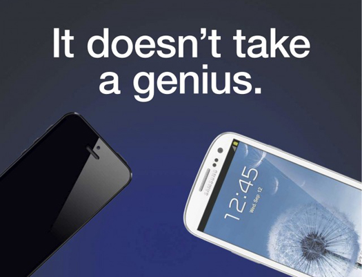
The “pan around web pages with your entire body” feature is called “tilt to zoom.” I’ve never seen any evidence that anyone uses it; after all, you can pinch to zoom or double-tap to zoom, both of which make more sense than double-pressing and extending your arms. It’s about three-quarters of the way down that list. I still don’t even know what half those other things mean and, might I remind you, I am a professional who has been briefed by Samsung several times on those specific features. And this ad, which appeared in the New York Times, looks as much like gibberish to me as it would to anyone else.
Samsung has a robot’s attitude toward what makes a phone good. Bigger is better. If you can make your features into a longer list, that’s better. If you can have four ways to do something when the other guy just has one, that’s better. Because four is more than one. That doesn’t mean they make bad stuff. I like the Galaxy Nexus a lot! It’s one of my favorite phones. But it’s a perfect illustration of exactly how Samsung thinks about their products–like you can measure user experience with a list.
