
We may earn revenue from the products available on this page and participate in affiliate programs. Learn more ›
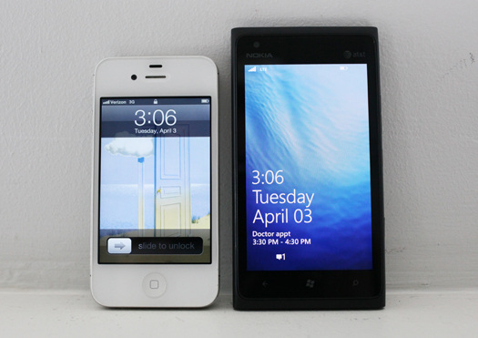
If you want to buy a phone right now, and you’re shopping based on quality rather than price, you have two choices in terms of size. You can get the iPhone, with its 3.5-inch screen, or you can choose from a handful of top-tier Android and Windows phones, all of which will have, at the bare minimum, a four-inch screen. Most of them will be bigger–4.3 inches is much more common right now, and an increasing number are even larger, including the Samsung Galaxy Nexus (4.65 in), HTC Titan (4.7 in), and the Samsung Galaxy Note (which, at 5.3 inches, is more lunchtray than phone).
The Nokia Lumia 900 is essentially a 4.3-inch version of the Lumia 800, a phone I absolutely loved in its 3.7-inch iteration (a Europe-only model). So reviewing the Lumia 900 presents an interesting question: with most other specs remaining constant, how does the experience of using a phone change when it grows to the size most phone manufacturers insist we really want?
WHAT’S NEW
The Lumia 900 is Nokia’s first “flagship” Windows Phone that’s available in North America (the Lumia 710, a cheapie, has been available on T-Mobile for a little while already). It’s the sequel to the much-admired Lumia 800 and its changes are mostly in size (of various sorts). It’s got a 4.3-inch screen, compared to the Lumia 800’s 3.7-inch screen; it has 4G LTE (on AT&T), compared to the Lumia 800’s 3G; it has a bigger battery and a front-facing camera.

WHAT’S GOOD
This is mostly a good phone. Windows Phone is a great operating system; it’s still maturing, but it’s very usable, and it’s an interesting and distinctly different approach to a smartphone than iOS or Android. (More on that here.) The physical design is pretty good; it’s inoffensive, at worst, and is weighty enough to feel sturdy rather than cheap and plasticky, as many Windows Phones do (especially those made by Samsung). It’s also nicely thin, only a millimeter or two thicker than the iPhone. The screen, though not thrilling in its resolution, has great deep blacks, which is important when using an OS with a predominantly black interface by default.
AT&T’S 4G LTE continues to be great. This is the first phone using AT&T’s LTE I’ve personally used, and it feels just as screamingly fast as Verizon’s. It’s startling how quickly things load–LTE is as fast or faster than many people’s home internet connections, so apps download instantly, web pages load instantly, music and podcasts sync instantly. I was impressed with AT&T’s coverage too–I used the Lumia 900 all over New York City and it never dropped out on me. And the giant 1830mAh battery will get you through a full day with normal use, which is not always the case with the current crop of LTE-capable phones.
WHAT’S BAD
Bigger is not better. Gadget makers will tell you I’m wrong–they’ll point to sales numbers, saying that people have embraced big phones by the millions. But you could just as easily point to the iPhone, the most successful phone line in the country by a long shot, and say that it proves that people love smaller phones. Or you could remember that if you want a good Android or Windows phone, you are basically forced to buy a giant one. There are no longer any top-tier 3.7-inch phones. There are a rapidly decreasing number of 4-inch phones (the Motorola Droid 4, an above-average but not particularly special phone, is the only high-end 4-incher released in the past six months). If you’re shopping Android or Windows, your choices are limited to big or bigger. And that’s not necessarily for the better.
Most gadgets need to be of a particular size to fulfill their particular roles. A phone has to fit in your pocket or purse. An ebook reader has to display a page of text. A tablet has to provide a full web experience. You can’t just stretch it out, like it’s a Gumby made of silicon and glass and metal and plastic, and say it’s a better device because of it. And that’s exactly what the Lumia 900 is. The phone is _big_–not as big as a Galaxy Note, but big. It’s actually wider and thicker than the Samsung Galaxy Nexus, a phone with a substantially bigger screen.

I have small hands (we all have our hurdles in life), and for me, any phone with a screen bigger than four inches is more difficult to use than it’s worth. In regular use, I find myself constantly readjusting my grip–I can’t hold the phone and reach all parts of the screen with my thumb. Beyond the overall size increase, I don’t think the bigger screen has any real benefits in this case. The Windows Phone keyboard is excellent; I never found it awkward to type on the smaller Lumia 800, so unless you have the sausage fingers of Billy Joel (YouTube it, the dude has ten kielbasas attached to his palms), I can’t imagine this being a striking improvement. The screen is also mathematically worse than the Lumia 800’s. It’s the same exact screen–a PenTile AMOLED screen with 800 x 480 resolution and Nokia’s ClearBlack tech, which, if you don’t understand that, congratulations for not having so much nonsense rattling around in your head. What matters is that it’s the same number of pixels stretched across a larger canvas—the opposite of Apple’s approach with its Retina Display—which means a visible downgrade in image quality.
So on the Lumia 900, the picture is worse. It creates a bigger bulge in my pocket. What’s the point?
All the buttons are on the right edge of the phone, even the power/hold button, which is often found on the top edge. That’s essential, because it’s not really possible for anyone besides Hakeem Olajuwon to reach the top edge of the phone while holding it with one hand. But with it placed on the side, I found myself accidentally hitting the hold switch often, since it falls directly under your right thumb.
The design is also somehow not quite as enthralling as the sleek Lumia 800, even though it’s nearly identical. It’s the little things, which add up to a different impression when you’re dealing with a very simple design presentation. Example: the 800’s screen was curved, with the screen seeming to melt off into the sides of the phone like an infinity pool. The 900 has a typical flat screen, with a more definitive bezel between the screen and the sides of the phone, and a weird raise ridge around the edges. It’s a very minimalist design, which worked for the 800, because it had nice little touches and felt compact and sharp. The Lumia 900 isn’t bad-looking, and it’s certainly well-crafted, but it’s also not that interesting.
The camera remains not very good. I was surprised at this with the Lumia 800, and I’m still surprised–the Nokia N8, probably the worst phone I’ve ever reviewed, had a stellar camera, and Nokia is well-known for their phone cameras. The Lumia 900’s is average at best–I love that it has a dedicated shutter button, and shutter speed is pretty good, but I wasn’t impressed with image quality. The Lumia often came up with very dark shots, and color reproduction was sometimes off. And in lower-light situations, photos were extremely noisy.

The hardware handles the Windows Phone operating system pretty nicely; it’s responsive and fast, for the most part. The way it scrolls still feels not quite as organic as iOS–there’s a little lag, and sometime the “flick” motion results not in a super-fast scroll, like you wanted, but a slow trudge downwards through a list. Otherwise the software has the same ups and downs (and it’s mostly ups, to be clear) as any other Windows Phone, plus a few Nokia-specific apps (Nokia Drive, a free turn-by-turn GPS app; yet another mapping app, Nokia Maps; and a little Nokia-curated section of the App Marketplace).
THE PRICE
It’s available on AT&T for $100 with a two-year contract. That’s half the price of other 16GB phones like the iPhone, and probably a good way for Microsoft and Nokia to worm their way back into the public consciousness. It’s a good deal, though given the fact that you’re signing a two-year contract that’ll cost you several thousand dollars in voice and data plans, it doesn’t really make sense to care much about an extra $100 up front.

THE VERDICT
The Lumia 900 is a pretty good phone–I still think the iPhone is a smarter buy on AT&T, due to its gigantic and thriving App Store, sleeker hardware, and more polished software, but the Lumia 900 is very nice. And yet I don’t think it’s as good a phone as the Lumia 800 (though the LTE speeds are delightful). It’s a weird feeling to be disappointed while still recommending a product, but that’s how it goes–the 900 doesn’t live up to my expectations, but it’s still the best Windows Phone in America. Still, it feels a little dull, where the Lumia 800 felt fresh and new and stylish. But most of all, I’m turned off by the size. Dear phone manufacturers: I know it’s an easy sell to say that your phone is bigger and therefore better–but for some of us, it’s simply not the case.