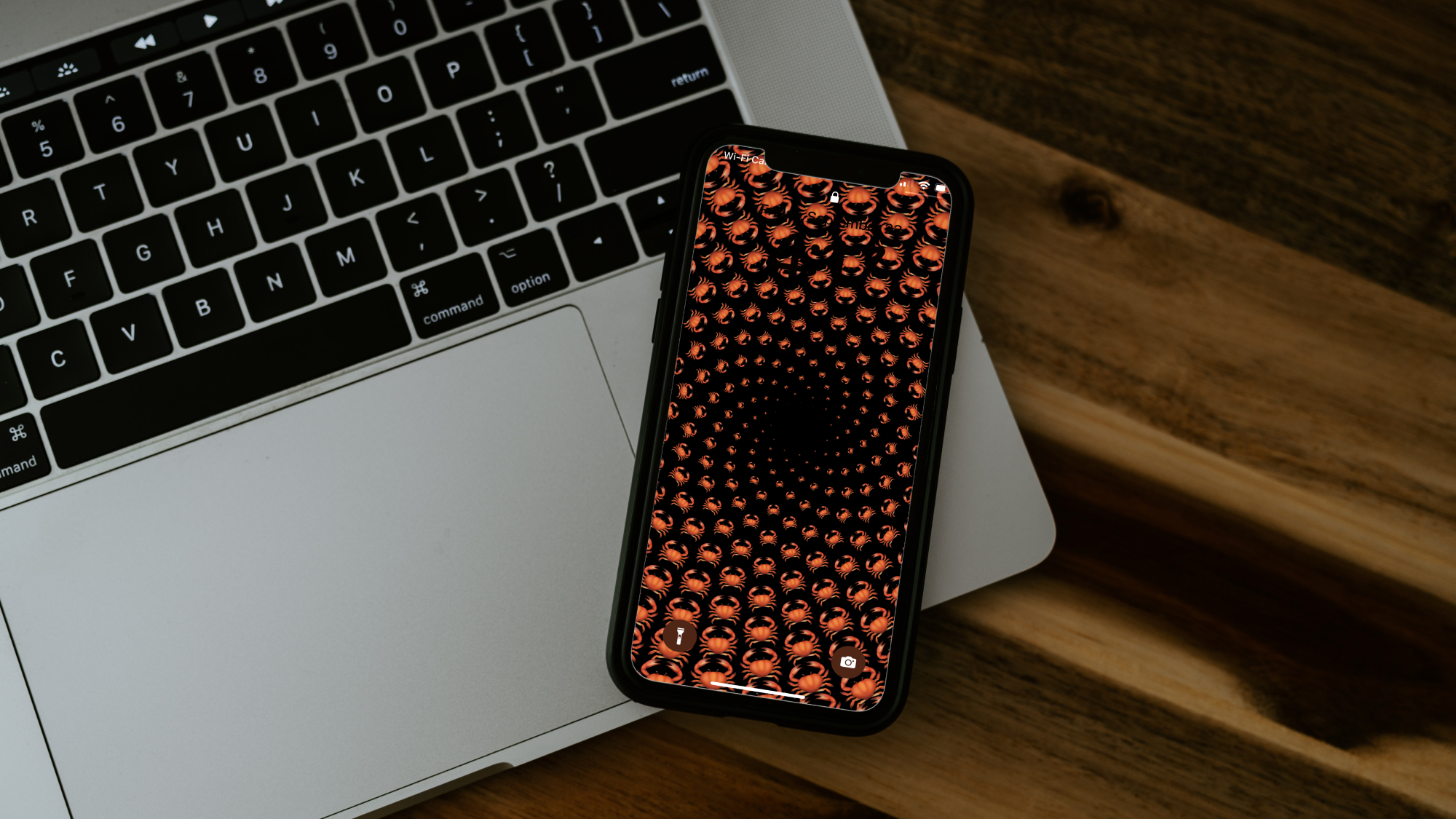

The iPhone security screen, once purely utilitarian and utterly unremarkable, is now a blank canvas just waiting for you to turn it into a work of art. When you edit your lock screen on iOS 16, you can shuffle photos, change font style and color, add helpful widgets, and uh, turn the whole thing into a dizzying vortex of crabs, if that’s your style.
All of these customization options appeared when Apple released iOS 16 in September 2022, so you won’t be able to use them unless you’re running some version of that OS on your phone. To download iOS 16 or double check what you have, open the Settings app, tap General, and choose Software Update. All set? You’re ready to turn your handheld distraction box into an absolute masterpiece.
How to add a new lock screen in iOS 16 or edit an existing one
One lock screen is not enough. You need… more. To get them, open the Settings app and go to Wallpaper. Under the images of your current lock screen and home screen wallpapers, you’ll see Add New Wallpaper. Tap that to start building something new.
You can edit your existing screens here too (via Customize at the bottom of each one), and everything described in this story will work exactly the same way. Just swipe left and right to move through your catalog and when you’re done tap Set as Current above whichever pair you want to use as your lock and home screen of the moment. There’s also a more efficient way to edit your creations than going into your iPhone’s settings every time—we’ll get to that.
The one catch here is that when you edit a lock or home screen, you won’t be able to change the background style. That means if it’s a photo, you won’t be able to have it display the weather, an absurd emoji pattern, or anything else—you’ll only be able to change the pic. The only way to choose from all available styles is to add a new wallpaper and start fresh.
What you can add to your lock screen in iOS 16
The Add New Wallpaper menu offers a slew of options. You’ll see a list of all available styles at the top, but the page also contains a number of featured presets Apple thinks you might like. These include custom designs, suggested photos from your phone, and color gradients, but they’re all variations on iOS 16’s main wallpaper styles, and you can do better. This is the DIY section, after all.
Photos
Setting a photo as your phone’s background is a classic move, and it’s the first visible choice on iOS 16’s wallpaper creation screen. Tap Photos from the row at the top of the screen, and you’ll have the option to dig through All your photos or browse those Apple has grouped under tags like Featured, People, Nature, and Cities. (The People tag here and the People option on the main screen lead to the same place.) If you’ve painstakingly organized your phone’s photo library, toggle the switch at the top of the screen to Albums to dig through your well-curated catalog.
You can also use the search bar here to hunt down something specific, including words in images. That means if you enter “New York,” your iPhone’s Live Text feature will dredge up any photos of the “Welcome to New York” highway sign you may have taken, screenshots of text messages where you mention the state, and pics Apple knows you snapped within its borders.
[Related: Apple iPhone 14 comparison]
Once you’ve made your choice, you can edit your lock screen photo. Pinch the screen to crop it by zooming in and out, but know that you can’t make the image smaller than the screen. Don’t like how it looks? Tap the photos icon in the bottom left (a stylized rectangular portrait of mountains) to find another one.
With a pic in place, swipe to the left to choose from four filters: natural, black and white, duotone, and color wash. The first two are self-explanatory, and the latter pair cover the original image with different-colored tints.
Finally, tap the three dots in the bottom right to see if you can activate Depth Effect. This won’t be available with all photos, as it pulls whatever’s in the picture’s foreground out in front of the clock and any widgets you may have on your lock screen. Behold: depth. If the foreground selection will cover too much of your clock and/or widgets (maybe about 50 percent), you won’t be able to use this feature.
A photo slideshow
New to iOS 16 is the ability to slap a rotating selection of images onto your lock or home screen. Tap Photo Shuffle from the options at the top of the main wallpaper customization menu to start. Find Shuffle Frequency in the middle of the page and tap on it to decide if you want the pictures to change On Tap, On Lock, Hourly, or Daily. The last two are self-explanatory, On Tap will allow you to change the lock screen display any time you touch it, and On Lock will move to the next image whenever you lock your phone—even if you haven’t unlocked it.
From there, you have two choices: Use Featured Photos or Select Photos Manually. For full customization, pick the latter, and tap or drag to select multiple photos for your background. Hit Add in the top right corner of the screen to move on.
If you’d rather use Apple’s featured images from your photo library, first tap People, Nature, Cities, and any other options on the screen to add or remove those groups of images. Touch Choose next to People, and you’ll be able to tap on thumbnails of people’s faces to decide which ones show up in the shuffle—hit Done to finish. When you’re ready, tap Use Featured Photos to continue.
Whether you used Apple’s selections or picked manually, the editing process is essentially the same as the one described above for a singular pic. Just tap the screen to move from photo to photo.
While editing, the three dots in the bottom right will let you set the shuffle frequency if you missed it on the first page or decided to change your mind. If you chose your own images, you’ll also have the option to enable Depth Effect, but not if you went with the featured pics. Instead, you’ll see Don’t Feature Photo—tap this to cut anything you don’t like.
The icon in the bottom left will be different depending on if you chose your images manually or not. If you did, it’s a grid of six rectangles—tap it to Add Photos to your rotation or Select the ones already there. Use the latter option to highlight one or more existing images, and you’ll see a trash can icon. You can touch that to remove any pics you’d rather not use. Run with Apple’s featured photos, and the icon will be a stack of rectangles with a sparkle icon on them. It will let you change the categories included in your shuffle.
Emojis
Personally, I found this choice to be the most chaotic, but there’s a lot of room for customization. Tap Emoji from the main wallpaper creation menu, and you’ll be able to type up to six emojis that will display in a pattern on your lock and home screens. When you’re ready, tap above the emoji entry menu or hit the X in its top right corner to continue.
Swipe left to choose from six available patterns, from grids of various sizes to a hypnotic spiral. Tap the smiley face icon in the bottom left to change your emoji selection, or hit the three dots in the bottom right to adjust the background color.
The weather, outer space, or color
The Weather, Astronomy, and Color options are the most basic wallpaper options available, but that doesn’t mean they’re uninteresting. Tap Weather, for instance, and your wallpaper will be a slightly animated depiction of whatever the weather is where you are, but that’s it.
Astronomy is a little deeper, as you’ll be able to choose from Earth (a view of our planet suspended in space), Earth Detail (where about a quarter of the visible hemisphere fills most of the screen), the same two options for the moon, and Solar System (which shows all the planets and their orbits around the sun).
[Related: Why is Pluto no longer a planet?]
Color is fairly self-explanatory: You choose a color, adjust its hue with the slider at the bottom of the screen, and pick from one of six gradient options. If you don’t like what it looks like, hit the colored circle in the bottom left to pick again.
How to edit the time on your lock screen
No matter which wallpaper style you chose, the clock will be the next-largest piece of your lock screen. You should take some time to customize it—everything’s part of your new aesthetic. Tap the time and choose from one of eight fonts and countless colors, including making the digits opaque (the first color option on the left). You’ll only see 15 colored dots across the bottom of the screen, but if you’re not feeling any of them, the final one on the right will let you pick colors from a grid or spectrum, or plug in a specific color hex code to get exactly what you want.
Within the Font & Color menu, there’s a globe icon in the top left corner. Tap this, and you’ll be able to choose whether your clock displays Arabic numerals (the ones used everywhere in this article), Arabic Indic numerals (used in parts of the Arab world), or Devanagari numerals (used in northern Indian languages).
If you hate being reminded of the constant march of time, sorry, you can’t remove the clock and you can’t change its position either. What you can do, however, is try to get the color to match the wallpaper so those anxiety-inducing digits disappear partially or completely.
Add widgets to the iOS 16 lock screen
There are two places you can place widgets on your iPhone’s lock screen: above and below the clock. The thin space at the top of your screen will likely display the date by default, but you can tap it to select another widget instead. You can customize some of these upper widgets by tapping them once they’re in place, but mostly what you see on the Choose Widget menu is what you get.
The main widget area is below the clock, and it will hold up to four (or none, if you really don’t want to obscure your lock screen photo). Just tap where it says Add Widgets, and you can choose from the options available. No matter how many you choose, they’ll stay centered in the space, and you can remove any you don’t like by tapping the minus icon at its top left corner. To reorder them, press and hold a widget until it grows a little under your finger, then drag it where you want it to go. One wrinkle: if you choose a widget that takes up two of the four spaces, it will always display on the left—you can’t move it.
[Related: 24 hidden iPhone settings that are actually useful]
You’ll be able to fine-tune most of the widgets that go beneath the clock by tapping on their app’s name (they’re listed below the suggested widgets in the Add Widgets menu) to choose from varying amounts of display options. The reminder widget, for example, will only show you the next thing you have due each day, while the weather widget offers a wide selection of data visualizations.
Most widget options will be available in both places, though you may see some exceptions. The battery widget, for example, can only go underneath the clock, where it will show how much juice is left in your phone or any connected devices.
One note on this: it’s annoyingly difficult to customize widgets in the upper section. There, you can only adjust a widget immediately after putting it in place. If you do something else and come back, you won’t be able to tweak it. So if you’re wondering why your clock widget is stuck displaying the time in Cupertino, California, not, say, your parents’ hometown, you’ll have to tap the upper section, choose another widget, tap elsewhere, touch the upper widget area again, choose the clock widget, and immediately tap it to pick a specific city. Gross.
Thankfully, this obnoxious workaround isn’t necessary in the main widget section under the time, where you can customize any widget whenever you want.
And if you’re wondering why your weather widget won’t work, it’s because you turned your location off in the weather app settings. To fix that, open the main iPhone settings app, go to Weather, Location, and select While Using the App or Widgets, Always, or While Using the App. With these options on, you can still turn Precise Location off for a little bit of privacy. Doing so means your weather app can only determine your approximate location (it was about 4 miles away from me).
Finally, hit the X or tap outside of the widget menu to set your selections.
Finalize your lock screen
When everything looks perfect, hit Add in the top right corner of your screen. To apply your fresh new lock screen to your home screen too, tap Set as Wallpaper Pair on the next screen. If you’d rather have all your app icons display on top of something else, choose Customize Home Screen to adjust the color or pick a new photo for what’s essentially your phone’s interior wallpaper.
If you told your phone to use a wallpaper pair but the home screen isn’t working, it may be inadvertently blurred. To fix this, go to the main wallpaper settings screen, tap Customize under your home screen, and hit Blur. This should solve the problem.
Edit your wallpaper from the lock screen
There are two ways to edit your wallpaper, but the most useful one is directly from your phone’s lock screen. To start, press the center of your lock screen to bring up the passcode entry keypad. If the keypad doesn’t show up and you have to swipe up to get to it, you’ll go to your home screen, not the wallpaper editing menu.
Do it right, though, and you’ll see a scrollable carousel of available wallpapers. Hit Customize to edit whichever one is front and center. You can also add a new wallpaper by going all the way right and tapping the blue plus icon in the center of the screen.
To delete a wallpaper, find it in the carousel and swipe up. Then tap the trash can icon and hit Delete This Wallpaper. Easy.
Finally, you can assign each wallpaper to a specific Focus, a feature that arrived with iOS 15. Just tap Focus at the bottom of any wallpaper to choose the one you want. If you hit Focus Settings at the bottom of the screen, you’ll go to that page in the settings app, closing the wallpaper customization screen. You can also choose a Focus wallpaper by opening the settings app, selecting Focus, and tapping one of the Focuses to Choose its matching lock and home screen.
Phew, that’s all there is to say about the new iOS 16 lock screen settings and customization features. You may want to queue up all of these possibilities like outfits in a virtual closet, or you may just want to keep that cute photo of your partner or dog. Either way, at least now you know that a vaguely threatening spiral of crab emojis is also an option.
This story has been updated. It was originally published on September 12, 2022.
