
We may earn revenue from the products available on this page and participate in affiliate programs. Learn more ›
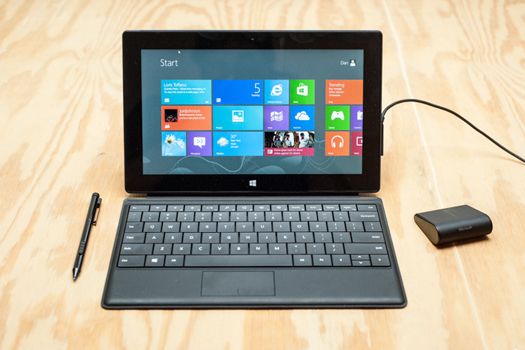
The Microsoft Surface Pro is easily the most interesting laptop to cross my desk in the past few years. Not the best, but certainly the ballsiest and most unusual. And it is a laptop; this isn’t a tablet, like its confusing sibling, the Surface RT, which looks nearly identical and was released late last year for half the price of this one. Instead it’s an experimental ultraportable, like Lenovo’s Yoga 13 (our favorite early Windows 8 laptop), which innovates with form and aesthetics while remaining, distinctly, a laptop.
What’s Good
The size, shape, and build quality are all great. This is a tiny laptop, with a mere 10-inch screen, weighing in at only two pounds. The smallest laptops on the market with this kind of power are 11 inches, and even those are rare–12- and 13-inch laptops tend to be the small ones, and those usually weight at least 25 percent more than the Surface Pro. Though it looks more like an iPad than anything else, it’s not a tablet in that sense–it doesn’t use a mobile operating system like the iPad, and so in fact, it’s a MacBook Air competitor, though it’s significantly smaller. It’s a smooth, angled tablet onto which you can magnetically attach one of several covers (two of which have keyboards on them). There’s a kickstand on the back that flips out solidly and securely to rest the screen on a table. When you attach a cover, flip out the kickstand, and sit the Surface Pro down on a table, it looks like a laptop. A laptop with a weird giant flip-out kickstand and a super-thin detachable keyboard. Then you can fold it all up and it looks like a tablet. A tablet with a USB port and a Core i5 processor and the ability to run any Windows program.

The screen is fantastic–not quite as sharp as a retina display on a MacBook Pro, but remember that this machine starts at $900, and the cheapest retina MacBook starts at $1,700. And that’s no knock against the screen, either; it’s incredibly sharp and vibrant, and the bold, colorful Windows 8 interface looks awesome on it. As a touchscreen, it’s definitely the most responsive of any Windows 8 devices I’ve tried–the Yoga 13 sometimes missed gestures, especially the swipe-from-the-side gesture that brings up a few settings, and the Surface Pro never suffered that problem.
It has minimal ports, but I didn’t find that a problem–if you’re buying what’s probably the smallest and most portable full-figured computer out there, you can’t expect it to have six USB ports and five ways to output video. There’s a magnetic power jack that shamelessly rips off Apple’s design, a MiniDisplayPort for connecting to an external display, one USB 3.0 port, and both front- and rear-facing webcams. I found the ports sort of tight when trying to plug in accessories, but I suppose that means they’re secure.
On the bottom edge of the Surface Pro is a very strong little magnet so you can clip on a cover. Microsoft gave me two, the Type Cover and the Touch Cover, and within just a few minutes it was clear which is the better accessory. The Type Cover is a real keyboard–it has regular keys, just like on any other keyboard. The Touch Cover, which is the one Microsoft has been advertising more heavily, is something very different–it’s just a piece of fabric with raised sections for the “keys.” There’s no actual “typing” to be done on the Touch Cover–you just tap the fabric.
The Type Cover stayed on my Surface during almost the entire testing period. It’s about the same size as the touch cover, but provides an actual keyboard with actual keys that move up and down as you press them. It’s small, but I had no problem at all jumping in and typing long posts on it, including this one–it has full-sized backspace and shift keys, arrow keys, setting controls on the top bar (play/pause, search, home, volume), and even a little trackpad. The trackpad is cramped, and for any serious computing you’ll want a real mouse, but in a pinch I was impressed with how well it worked. The Type Cover as a whole is fantastic, much better than the more publicized Touch Cover.

I still have mixed feelings about Windows 8’s schizophrenic tablet/laptop dueling interfaces, but there’s no denying it has potential. Here’s what that means, in a nutshell: Windows 8 has two distinct interfaces, one designed for touch and one designed for keyboard/mouse. You can think of them as “tablet mode” and “laptop mode.” Tablet mode needs entirely new apps, while laptop mode uses any of the bazillion bits of software already available for the bazillions of older Windows computers. The (few) Windows 8-specific apps are often lovely, especially the video apps like Netflix and Hulu Plus. And because this is a real x86 laptop, you can run any old Windows software, reaching back decades. I called up my old Windows friends instantly–Pidgin, VLC, Chrome, Photoshop, Tweetdeck–and they all work just fine.
Battery life was just fine–I was getting about six hours of heavy use before having to recharge, which is on par with other ultraportables.
And I think the price is totally fair. You get more for your money with the Surface Pro than the MacBook Air, including double the storage (128GB vs. 64GB at the $1,000 price point) and a nicer display, plus a flashier interface and a smaller physical footprint.

What’s Bad
The tablet-plus-detachable-keyboard design is definitely novel, but I’m not convinced it’s a better solution than a convertible (aka a screen that flips around) like the Lenovo Yoga 13. For one thing, it’s near-impossible to use it on your lap; the kickstand is really only capable on a hard, flat surface, which my crotch is not. Also, the screen’s angle isn’t adjustable. The angle isn’t awful but I found myself wanting to tilt it backwards more than once. I never quite found the use case that really had me thinking “oh, that’s why it makes sense to have a detachable keyboard,” partly because I was never really without the Type Cover–it was protecting the Surface, after all!

The Type Cover, while surprisingly good, is still not as good as a real keyboard would have been. And the Touch Cover, the touch-only fabric keyboard cover Microsoft’s been advertising the hell out of, didn’t do it for me at all. It has no travel at all–it’s just a piece of fabric, so the keys don’t move when you type on them. Bend down and tap your fingers on a short dense carpet. That’s what it feels like. Not good! With practice it would probably be faster than an on-screen keyboard–it has some very fancy tech in it, like sensors that can tell if you’re “typing” or just resting your hands on the keys, and of course you don’t have to worry about a virtual touch-keyboard taking up half your screen space, but I did not find it to be a particularly good typing solution. I made frequent mistakes with it and never really found my rhythm to get comfortable with it. Microsoft spent years in R&D on this thing and I can’t imagine why. Forget the Touch Cover. The Type Cover is great, get that.
My review unit came with a Wedge Mouse, a tiny half-sized mouse that’s kind of like a regular-sized mouse that’s been chopped in half so it’s only about an inch longer than its buttons. Microsoft actually makes some of the best mice out there, but, um, this one’s a miss. It’s uncomfortable to grip and the scrolling is jerky and unreliable. Skip it.
(The stylus, on the other hand, is pretty nice. Cheaply made, but very effective and accurate, and doesn’t require any external power.)

The screen size and keyboard size is going to be an issue for some people. It’s very, very small, which is great for portability but not so hot when you’re trying to get a bunch of work done. Specs-wise, the Surface Pro is powerful, thanks to the Core i5 processor and quick SSD drive, but the tiny screen definitely hurt my ability to multitask. I worked for two full days on the Surface Pro, and my work day is demanding for any computer–I always have at least 15 tabs open in my web browser, editing, writing, doing light photo and video editing, using several chat rooms and IM programs, listening to music, constantly monitoring TweetDeck–and I found, power-wise, that the Surface Pro was capable. But doing all that on a 10-inch screen, with a minuscule trackpad, was much more difficult than on my typical 13-inch machine.
Windows 8 has also its issues. I went into them more deeply on the Lenovo Yoga 13 review, and things haven’t changed since then, so it still has a distinct lack of new apps and a definite sense of confusion. Which app do I use, the touch version of Internet Explorer or the desktop version? Do I download an app for instant messaging or just use something like Pidgin, an old Windows app?
And the touch apps are limited in number as well as quality; the Twitter apps are awful, for example, and it’s lacking Facebook, Spotify, Rdio, Simplenote, Instapaper, most photo sharing apps (Flickr, Snapchat, Vine)…the list goes on. Microsoft hasn’t had much success getting top-quality apps to Windows Phone, so hopefully they make a major push for Windows 8.

But what was almost more interesting about the Surface Pro is that during my workday, I completely ignored all of the new fancy apps and interface. To really get work done, I stuck in “desktop” mode, which is where all the traditional apps are, and barely felt like I was using Windows 8 at all. I hardly ever used the new apps, even the good ones–sure, the Netflix app is nice, but I can just go to Netflix.com and use a real keyboard for searching and a real mouse for navigating. Sure, MetroTwit, the most popular Windows 8 Twitter app, is beautiful, but it’s also functionally sparse compared to the old Windows version of TweetDeck. I’m just not seeing a compelling reason to use the new apps.
And that’s kind of a problem, too–I immediately ran into all of the old Windows issues (“why do I have to install the .net 2.0 framework? What the hell even is that? Why did the Surface freak out and crash when I connected an external monitor?” etc.) that any old Windows 7 PC has. The new apps are pretty, but when you give me the significant power of an Intel Core i5 processor, why would I use software that’s designed specifically so it’s easy to run on low-powered hardware?

The Price
Starting at $900, which is reasonable, considering the size advantages and impressive build quality of the device. That one comes with 64GB of solid-state storage, but if you’ve decided on a Surface Pro, I’d recommend making the jump to the 128GB model, which’ll cost an extra $100. The operating system takes up a lot of room, so you want all the space you can get.
The Verdict
I like the Surface Pro a lot! I have a ton of admiration for Microsoft for really putting themselves out there and making a weird little product that mostly delivers on its promises. The build quality is amazing–this is the first laptop I’ve tested that really feels as unique and premium as the MacBook Air. And the thing is very powerful and capable.
But the tiny screen size, lack of apps, and general sense of confusion around Windows 8 makes me hesitate in recommending it over the Air, which I would consider the best ultraportable on the market. After a day of work, I just found the Air to be a more comfortable computing experience–fewer error messages, a more spacious and feature-filled keyboard and trackpad, a clearer vision as regards software. The Surface Pro is cool as hell, but if you gave me a thousand dollars and had me buy a laptop? I’d get the Air.
