
We may earn revenue from the products available on this page and participate in affiliate programs. Learn more ›
The Lumia 800 is supposed to be kismet: Nokia makes great hardware, but terrible software. Windows Phone is great software, but the only phones that use it are yawn-worthy plastic rectangles. The Lumia, Nokia’s first Windows Phone, is finally here, and if it’s not as, well, new as some might have hoped, it’s still a very, very fine smartphone–probably the best Windows Phone out there, which should make it high on your list if you’re looking to buy a new phone this fall (and you live in Europe and/or are rich).
WHAT’S NEW
This phone isn’t new, exactly. It has previously existed as the Nokia N9, a thoroughly odd outlier of a phone that may be the only phone to ever use the MeeGo operating system. It uses Windows Phone 7.5, which we reviewed earlier, with a few Nokia-centric additions like Nokia Maps, Nokia Music, and Nokia Drive (turn-by-turn navigation). But mostly, what’s new is some solid hardware for Windows Phone.
WHAT’S GOOD
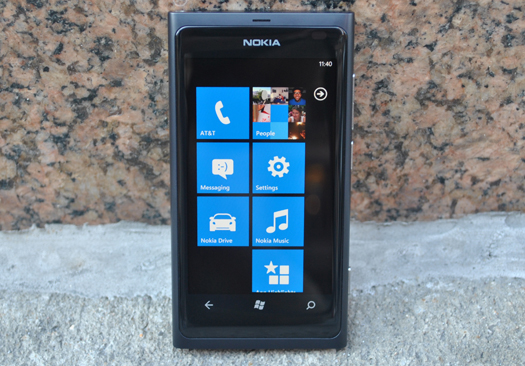
I love this hardware. There’s something about the weight, size, finish, and balance that just feels right. It’s distinctive but still tasteful, made of some kind of polycarbonate that feels somehow metallic, with curved sides and a 3.7-inch screen, the glass covering of which curves with them. It’s all made from one piece of the metallic-feeling plastic, and it’s the same color the whole way through, so if you scratch the phone, you won’t get a streak of white. The phone is ever so slightly thicker than the iPhone, a millimeter or two at most, so it still feels very sleek in the hand.
The design warrants some further thought. Most phones just feel put together, the work of engineers. Motorola’s Droids are angled, sort of ugly but hyper-functional; Samsung’s phones are exceedingly slim, light, and plasticky; HTC’s are kind of rounded and inoffensive. The Lumia 800 feels designed, like some kind of industrial artist in a loft space somewhere in whatever the Finnish equivalent of DUMBO is sketched out what a phone should look like. The screen melts into the curved sides of the phone. It bulges ever so slightly into your hand at the back. It feels smooth, but slightly matte, so it isn’t slippery. It doesn’t even think of flexing or creaking when you try to bend it. It’s weighted–probably the most often overlooked indicator of “quality” in a smartphone–but not heavy. I’m not going to call the phone sexy, because my sexual preferences do not include inanimate gadgets, but if your preferences do lean that way, no judgments, the Lumia will be right up your alley.

It doesn’t have barnburner stats, but one of the things I really like about Windows Phone is how that doesn’t matter. Microsoft once told me that they had spent so much time making sure the OS runs buttery-smooth on 1GHz processors that it doesn’t really make sense to sacrifice battery life for a dual-core processor when the user won’t see any improvement. And it’s true; dual-core Android phones still stutter, and the Lumia’s single-core 1.4GHz Qualcomm processor never shuddered for a second. This phone runs Windows Phone 7.5 admirably, even a little more smoothly than the year-old Samsung Focus I tested for our Mango review. I should also add that this is the first sub-4-inch Windows Phone I’ve used, and I was pleased to find that the keyboard is still excellent despite the reduced space.
The camera is also great–not as good as the iPhone 4S, and, oddly, not as good as the older and worse-in-every-other-conceivable-way Nokia N8. But still, definitely one of the better cameras I’ve used. It uses an f/2.2 lens, and gives more manual control than other Windows Phones to take advantage of it. I was very pleased with the image quality.
Nokia could probably stand to ditch the Nokia software that has a Microsoft equivalent. Nokia Maps and Music are not noticeably better than the Microsoft versions, though Nokia Maps (which is installed on the Lumia side-by-side with Microsoft’s Bing Maps) does include far superior public transit features compared to Bing Maps. Nokia Drive offers free turn-by-turn navigation, which is nice, although it doesn’t really feel natural–it was pretty clearly cobbled on. Still, it’s appreciated.
Oh, and I love Windows Phone. Read more about it here, but suffice to say, this is a great, innovative OS, one that deserves a look regardless of your gut feelings on the names “Microsoft” or “Windows.”
WHAT’S BAD
The Lumia 800 uses a PenTile screen, like most of the newer Motorola phones. PenTile is a technology that improves a phone’s battery life while keeping a fairly high resolution, but it comes at the price of this kind of weird pixelly swirling, like a mild but still distracting shroom trip. The closest legal comparison I can make is that it’s like you’re looking at the phone through a fine mesh screen. Compared to the Motorola Droid Bionic, which has a PenTile screen that borders on unusable, the Lumia’s is pretty good. But compared to the iPhone’s Retina Display, or the great Super AMOLED displays used in Samsung’s Android and Windows Phones, it’s just not as crisp as I’d like, especially in high-detail situations like a zoomed-out website. That being said, the Lumia has probably the best, darkest blacks I’ve ever seen on a phone, which is a very good thing in an optionally black-heavy OS like Windows Phone.

16GB of non-expandable memory is pretty low, especially given how great a media device this is. It’s not a dealbreaker, especially if you use a subscription music service like Rdio, Spotify, or, I guess, Zune, but 32GB or more would be preferable.
Otherwise, I have no real complaints. The microUSB port is hidden underneath a clever but slightly hard-to-open door that feels like it’d be the first (and only) thing to break on the device. And I don’t really understand the point of having two full map systems (Nokia and Bing) on one phone.
There is one big problem. This phone is not available in the States, nor has it even been announced that it will eventually come here. Why, Nokia, why?
THE PRICE
The Lumia 800 is not available here in North America, but it will launch in the U.K. on November 16th for £399, in three colors: black, very bright blue, and very bright pink, all in 16GB capacities (with no microSD expansion–you’re stuck with 16GB). Rumors point to a possible early 2012 launch in the U.S., where it would be significantly cheaper due to the U.S. system of subsidizing. Interestingly, you can use an AT&T microSIM card: I was getting speeds of around 1Mbit/sec down, which is fairly average, though at that price–around $650 USD–you’re going to really have to want to import it.
THE VERDICT
The Lumia 800 is the best Windows Phone I’ve ever used, and I’ve used most of them. Others are bigger, or have more impressive specs, but that’s not what Windows Phone is about–it’s about smooth, sleek, stylish operation, and it deserves a phone to which those adjectives can be safely applied, which the Lumia 800 certainly is. I kept picking the phone up and playing with it, even without a SIM card (and thus without service). It feels good. It looks good. It works well. Please come to America, Lumia 800. It’s pretty nice here.
