
We may earn revenue from the products available on this page and participate in affiliate programs. Learn more ›
A Microsoft tablet with Windows 8 has been a long time coming, but it’s finally here. Sort of. We got our hands on a developer’s preview yesterday and while flawed, it’s extremely impressive.
Keep this in mind as you read: both the operating system and hardware are developer preview builds. In fact, the REDACTED* hardware (we’re prohibited from even revealing its manufacturer or specs) isn’t even going to run Windows 8. And the hardware has an x86 processor, not ARM. When this Slate ships, says Microsoft, it’s going to have Windows 7 on it. Microsoft doesn’t even have a name for this thing, which it was sure to note (repeatedly) is not the first Windows 8 device.
Confused? It’s like this: The tablet we got to play with was running a developer’s build of Window’s 8 on sub-optimal hardware, and, when this fistful of screen ships, it’ll be running Windows 7.
Whatever the hell this thing is, it’s a great preview of what’s to come, even if only for a limited time. And we do mean limited time. Microsoft’s press loaners are all due back in about 72 hours. I’ve been playing with this thing for the last twelve, trying to pack as much W8 into the time I’ve got. Here’s what we know:
INTERFACE
Let’s start with what it’s like to touch the thing: fantastic. It is, in fact, the most usable gesture-based interface on the market. It goes beyond what Apple has done by quite a bit. The entire operating system is navigable in a way that is both completely new, and yet familiar within a few minutes of use. Navigation includes some by now familiar touchscreen elements, but is largely novel.
Swiping from the left edge of the screen swaps from app to app. It’s blazing fast (even on this crazy setup), and as you swipe other running applications pop in as small windows that size up and take over your screen. You can also use this gesture to give over part of your screen real estate to a second running app, so you have two apps running side-by side in what Microsoft calls a snap state. Bawse.
Swiping the right edge brings up a persistant menu of “Charms:” five icons that act like a home row, letting you quickly jump to the Start screen, sharing, settings, devices, or search. Swiping from the top or bottom brings up application-specific menus and options. You can also use gestures to manipulate objects in heretofore unknown ways. Holding an element with one finger while swiping with another can move it around on the screen, for example. Quite simply, it’s the best gesture interface out there right now.
Yet you can also connect a keyboard, or use a stylus to input text (and it will recognize your handwriting, right out of the box). All of this worked very well. And generally speaking, text input is just great. The software keyboard is superfast and responsive. It is probably the best software keyboard I’ve used yet. I can’t type at the speed I do on a hardware keyboard, but it’s impressively zippy, and laid out well with ample space between keys, and easy to swap back and forth to numbers and special characters. There is even a split key mode for thumb typers.
OPERATING SYSTEM
Then there is the OS itself. The design is just stunning. It really makes you want to dive in and explore, and it’s exceptionally easy to poke around in and navigate.
Windows 8 is a complete re-think of Windows (and holy Moses did it need one because Windows 7 was a bad idea). In this version, you’re interacting mainly through so-called Metro applications. When you do fire up a Metro app (and in the shipping version of this OS, which Microsoft plans to build on lots of tablets with ARM chipsets, the Metro-style applications will be the dominant tablet interface) it completely takes over the screen. There is no Windows chrome to be seen anywhere, or even a home row of buttons or icons. It’s all app. It makes for a really immersive experience, and is especially nice on very visually-driven programs and games.
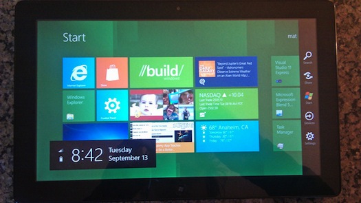
Metro apps show up on a unified Start screen. When you hit the Start screen, you see apps as tiles laid out in a grid. Goodbye, icons. As Jensen Harris, who runs Microsoft’s user experience team said, “icons are yesterday’s way of representing apps. Tiles are the more modern way of representing apps.” That’s kind of bullshit (even Windows 8 makes use of icons) but when you first encounter those eye-popping Metro tiles it feels true.
The tile concept is gorgeous and works wonderfully on a Slate. You scroll sideways across tiles, which you can also organize into groups by themes—and because they are so large it’s really easy to navigate around to what you want to do. Within individual apps, you can “pin” actions, creating new tiles. So, for example, you can pin Gizmodo.com from within IE (recommend!) and it will show up as a new tile on the Start screen. In addition to launching apps, Tiles convey live information at a glance. So the weather tile, for example, can constantly give you the current temp.
But it’s better in theory in practice. All of the apps tend to surface a lot of older data and repeat themselves. You see the same tweets and photos over and over again. New information doesn’t come bubbling up onto the Start screen the way it ought to. Again, this is a developer preview. We expect that will be remedied with the shipping product.
The new Search function works really well too. Bring up the charms by swiping the right edge of the screen, and an (old-fashioned!) search icon appears. When you enter a search term, not only will the interface show results with locally-named files and Internet results, but it can also search within various apps. The results show up in-app so, for example, you can find music results from within your music player without leaving the social media app.

YET TO COME
Some of its most promising features we weren’t able to experience. It will automatically sync your settings between devices, and save to your Microsoft SkyDrive, for example. Businesses will be able to set up custom apps and deploy them remotely, so users can log in to a remote desktop on the road and more or less have their work machines. And it isn’t just enterprise. You’ll be able to browse your home computers remotely too. The goal seems to be to get all your data on every device, everywhere. There’s also a built in app store, called Windows Store. Microsoft showed us a demo of building an app and deploying it to the store in a matter of minutes. There’s nothing there now, but we expect it will be pretty rich.
Don’t like new things? You old Andy Rooney, you. Good news, you can always swap over to Desktop mode and run a version of Windows that’s as familiar as 1995. Microsoft showed off a version of Photoshop running in this state, and reassures that all your existing Windows 7 programs will still run in that mode. But you won’t want to. The Metro apps are so inviting that going back to the old way of doing things feels, well, old.
THE BAD NEWS
There are hiccoughs. (Again, at risk of repeating myself repeating myself, this is a developer preview build, so we’re hoping a lot of issues will be remedied by the time Windows 8 ships. Which may be a while.) When I tried to watch a video on YouTube, I was notified that I needed to update my Flash player to version 10, which I was further notified was not available for my 64-bit Web browser. It prompted me to install a beta of 11. This kicked me over into Desktop mode. I reinstalled. I restarted. No luck. I still couldn’t watch James Brown dance. It was, precisely, every Windows and Flash usability cliche in you’ve ever heard in the space of a few minutes.
I asked people to send me videos on Twitter just to see how a random pool of Internet video would look. None of them worked. Not one. I was able to play a video on Vimeo that I navigated to myself, and subsequently found a few others, but Internet video as of now is a dark place for this Slate.
And then there’s the fan. Yes, this tablet has a fan, and it’s almost always running. Granted, this is an x86 device. But so is the MacBook Air, which doesn’t even have a fan has a miniscule fan that basically never runs. Microsoft talks a big game about how Windows 8 is going to be optimized for any device, but in its present state it seems to have some serious performance issues. Both the demos yesterday, and my personal experiences over the last twelve hours, were riddled with system freezes. Again, I know this is a developer preview, but it wasn’t encouraging.
IN CLOSING
YUSSSSSSSS. Largely this thing is great. You hate comparisons, but I’m going to make them: It’s not on par with the iPad (even the original version, to say nothing of the iPad 2.) There are simply too many things that don’t work as they should. But it’s already far more usable than any Android tablet I’ve encountered. By the time Microsoft gets ARM straightened out and can ship this OS on optimized hardware, it’s going to really sing. This is, in fact, the first tablet other than an iPad I can see myself buying and using. It’s early, but Microsoft seems to have a hit.
*Microsoft said we can’t say who made the tablet until after today’s keynote. (Damn, son.) But okay. That’s cool. We won’t mention which Korean manufacturer (that also makes lots of phones, some Android tablets, displays, televisions, and blu-ray players and is not LG or HTC) made this device until we get the official go-ahead.

Gizmodo is the world’s most fun technology website, focused on gadgets and how they make our lives better, worse, and more absurd.
